Picking A Colour Palette For Your Event
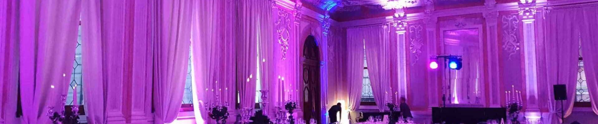
Choosing an event colour palette might not seem like a big deal, but it can actually make-or-break your event’s mood and atmosphere.
The role of colour has a lot more significance than we often realise, with many tones subtly changing your guest’s moods and their receptiveness to different event elements.
For example, many of us know that a more neutral palette evokes a sense of rest and ease, while yellows and turquoise’s are more likely to energise, and golds or blacks deliver luxury.
While it might seem daunting to figure out colour palette for events on your own, we’re here to help with practical tips, backed up by real event examples and successes from our very own events.
Consider the Event Type and Purpose
Your event type will play a big role in deciding your event colour schemes, as the colours for something corporate are likely to vary massively for a festival or family fun day.
A professional colour palette is likely to hold a neutral base for a clean and refined look, with a bold accent for energy or branding.
This could be greys, whites and a bold blue or turquoise accent, or matte blacks and charcoal’s with a vibrant purple.
A more playful palette might include pinks, blues, yellows and greens, or even neons for festival events.
Event colour palette ideas for luxury lean a lot more into elegance with ivory, gold, rich reds and potentially blacks.
An example of the power of a colour palette can be seen through the Signature Flight Awards Ceremony in Venice.
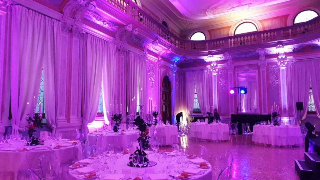
To exude luxury, the venue is draped in white silky cloth alongside gorgeous architecture, while the colours are projected onto this backdrop through lighting.
By implementing rich pinks to enhance their branding with an elegant backdrop, the company merged their own impression into a luxury look with our help.
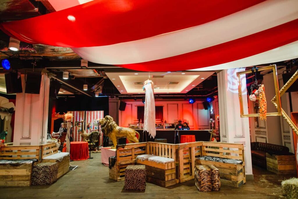
A more playful example can be seen in our Twisted Circus Halloween Party, capturing the event’s theming with bold whites and reds for circus atmospherics, while also considering pops of gold and scatterings of blue.
Colours can even play a role in optimising your event’s flow, guiding guest’s around your venue as more of an engaging experience, something important to consider when aiming to sell a product or draw attention to a large element.
Draw Inspiration from the Season
Your event’s colour palette might make more sense to be seasonal, tying into spring, summer, autumn or winter with your choices.
For a Spring look, you might take inspiration from our Newmarket Outdoor Easter Event, utilising lots of greens, pinks and blues.
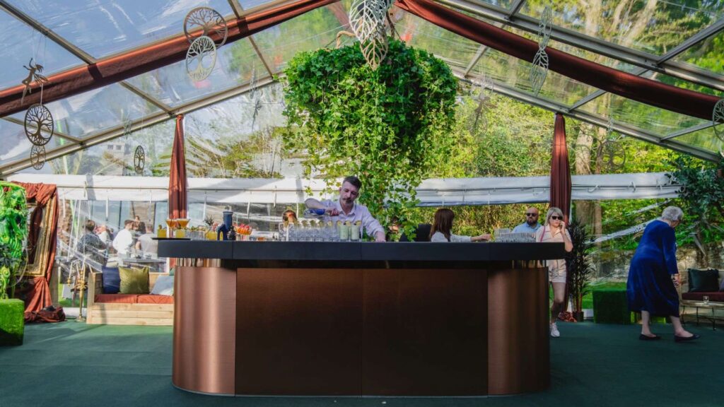
Summer on the other hand can be warmly embodied with our enchanted garden theming, offering lots of greens, florals and natural tones.
Autumn is perfect for leaning into more Halloween event colour schemes, with our Halloween themed events incorporating lots of oranges, blacks and purples.
The most popular is often Christmas though, with gorgeous blues and whites, or greens, reds and golds, depending on whether you’re after more luxury or playfulness.
Some of our most popular event themes tie into the seasons, making it easy to incorporate a suited colour palette for your event alongside a gorgeous theme.
Match Your Venue and Lighting
The impact of your colour palette for events can change drastically under different lighting conditions, whether it be time of day or just how your venue’s colour schemes might off-set your palette.
With that in mind, you should plan around what time you want your event to be set, and choose a venue that either works with your palette or can be beautifully contrasted with.
How to work with your venue’s colour palettes:
- Choose complementary colours in your selected colour palette
- Contrast against the venue’s colours intentionally
- Hire a company for theming to hide coloured elements of your venue, such as with draping or bespoke set design
Using mood boards and swatches for tests is a great way to get a visual feel in person for the differing effects, finding the best palettes for your event.
An event production team like ours can also help you source the perfect venue and create a dedicated colour palette designed for success.
Lighting itself can also be an effective way to implement colour, with pops of vibrancy that don’t have to be permanent throughout your event’s whole duration.
Our strong lighting design at our Alice in Wonderland event is a great example of how lighting can make an impact, splitting areas between bold greens, blues and purples.
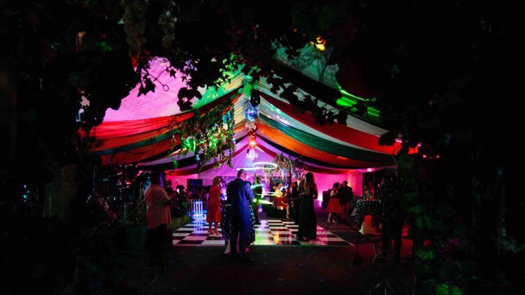
By zoning with lighting, no area feels too overwhelmed by colour, and the theming still pops with the colourful elements they deploy.
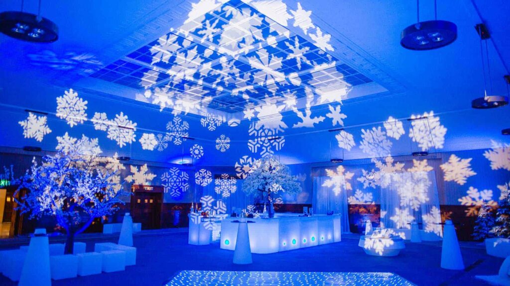
Bold icy blue lighting is perfect for Winter Wonderland themes too, perfectly complementing the white fabrics used to decorate, and a way to implement colour with ease and flexibility.
Colourful lighting is equally powerful when it comes to considering your event’s staging, creating a focal point through colour and brightness for entertainers.
Hiring a team like ours to create bespoke staging can also add to the overall effect, tying into your colour palette with even more effect.
Use Colour Theory
When designing colour palettes for events, it’s helpful to understand a few key principles from colour theory and how they tie into your event design.
Complementary colours are:
- Opposite each other on the colour wheel (like blue and orange)
- Used together to create high contrast and visual impact, with more boldness
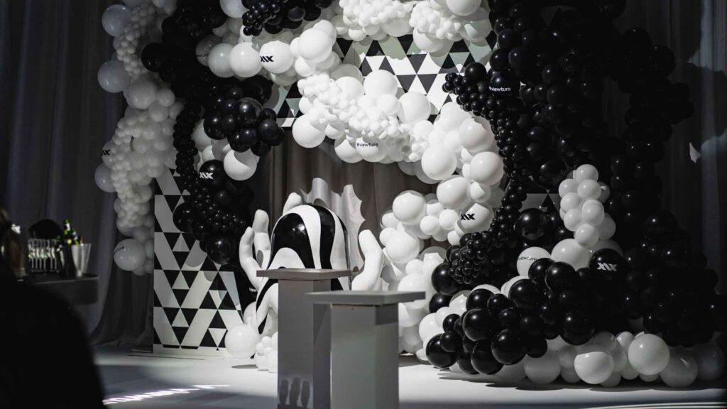
Analogous colours are:
- Next to each other on the colour wheel (like blue, teal, and green)
- Better for a more harmonious, cohesive look, ideal for relaxed or elegant environments.
Using a neutral base can help balance these colours, while accent colours add pops of interest without overwhelming the design.
It’s also worth considering practical rules like 60-30-10 rule, used to create a balanced and visually appealing colour palette.
It works like this:
- 60% is your dominant colour: This is your main colour and sets the overall tone for your event (such as through walls, large décor and table linens).
- 30% is your secondary colour: This is a complementary or contrasting shade that supports your dominant colour (such as with chairs, florals and accent walls).
- 10% is your accent colour: This is a vibrant or eye-catching colour used sparingly for big impact (such as in signage, cushions, lighting and small décor).
In events, this rule helps ensure colour harmony and prevents visual clutter while allowing room for creativity and focal points.
Designing an event space from scratch is often daunting, but keeping these elements in mind from the beginning is an easy way to ensure things stay on theme through the process of finding a venue, decor, props and choosing themes.
Align With Branding or a Theme
There are a lot of ways to incorporate your event colour palette within branding or a theme, incorporating your colours in corporate events and product activations.
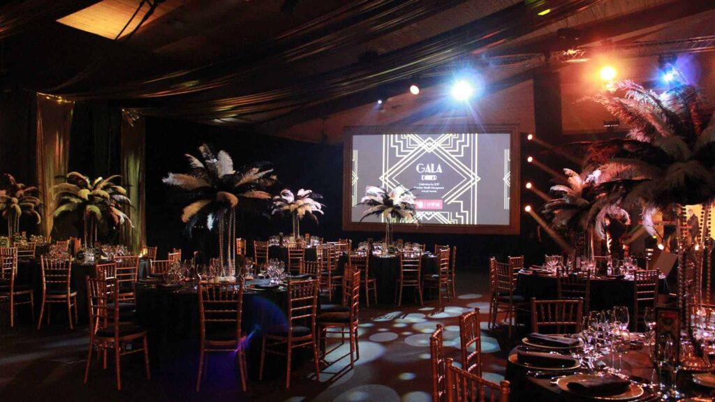
Our event themes like Gatsby, Futuristic and Boho all naturally guide you with palette choices, making your selection a lot easier.
1920’s Gatsby is perfect for more of a refined look, while our futuristic events embody more neons and drama.
There are even bold themed event installations that can tie into colour through lighting and design, creating big pops of impact for your brand or theme.
It’s just as important to be creative with your events though, breaking the rules sometimes to:
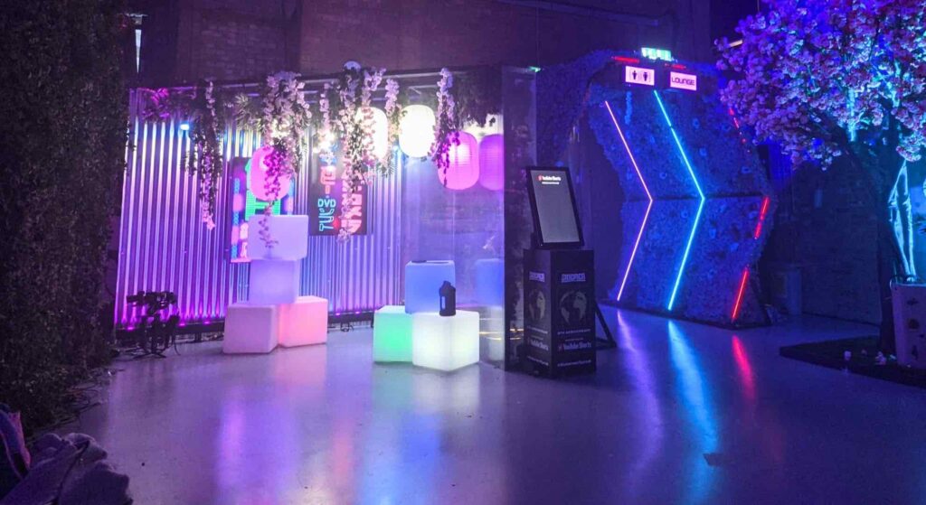
- Create contrast or surprise (like with a neon lounge inside a traditional ballroom)
- Encourage interaction by using unusual colour pairings such as in an art activation
- Make a statement (such as with pink and red for a bold Valentine’s gala, typically clashing, but powerful together)
- Brand disruption (for example, startups often break visual norms to stand out)
Test Your Palette Before Finalising
While you might feel confident in your event colour palette ideas, we’d still recommend using mock-ups, swatches, and lighting tests before locking in the final product.
All of these factors can drastically impact how your colours might be perceived, making it important to check it looks how you’ve visualised.
Working with an event designer or venue stylist from our incredible team can also bring your vision to life with a lot more ease, drawing on the help of a professional.
With our event design services, you’re sure to be able to pull off unique event design aspects that surprise your guests and leaves the colours popping.
Don’t hesitate to get in touch if you’re needing support to find your event’s perfect colour palette, we’re here to help with our support and expertise.
Conclusion
Never underestimate the impact an event colour palette can have on your atmosphere and guest experience, often setting the tone for the entire thing.
Through professional planning and testing, you’re much more likely to get the best results, working with the experts that have tried-and-true experience.
With our many years running events and our repertoire of work, we’re the definitive brand to work with for event design, colour planning, or theming support.
Get in touch today!
Related Services:
- Themed Events
- Venue Styling
- Event Production
- Event Management
- Event Design
- Set and Stage Design
- Lighting and AV
Events We Deliver:
See them all here.
Related Reading:
Get In Touch With Us Today.
With nearly 20 years of Event Management insight, working with world-renowned Clients we'll help you create your Dream Event.
Get in Touch